In the digital world, we witness a day by day change in technology and this is the reason that gives birth to the advancement in every aspect of web development and designing. The current trend is about competition, everybody wants to have unique and smart technique whether it is a website or a device.
- Must Read: 10 Web Development and Design Tools
Owing to this, we came across the huge change in the functionalities and features of various websites such as at first, there were static web pages, and then there comes a dynamic concept for site page after this, it evolved to the animated and flashing page. Many beginners and web professionals want to have the knowledge about the trending arts in web designing. So to make the concept clearer, this blog, presents every technique and strategy that are now implementing in web designing. By reading all these, you will learn something new in and will start implementing all these concepts in designing web pages.

Navigation with Vertical and Horizontal Scrolling
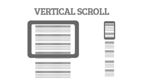
It is a well-known fact that a website with good interface design brings more value and customers. Good scrolling effect gives the best experience in navigating and directing to the different page. Now, it has become trending that when you scroll vertically down the website the header will always be seen at the top, so that you don’t need to go back at the top page. Horizontal scrolling is the best while exploring the product with features at e-commerce site. You can use both scrolling in the webpage to make the story/introduction of your site very clear.

Laying out the Content with Typography
Typography is the ultimate collection of ample style of fonts that enable to give the perfection in styling to the content with great art. In this way, typography plays the critical role in the designing of web content. Selecting the perfect typography give the amazing design to the content and it is obvious that this technique will stun customers.

Crafting a Page with Single Tone Colors
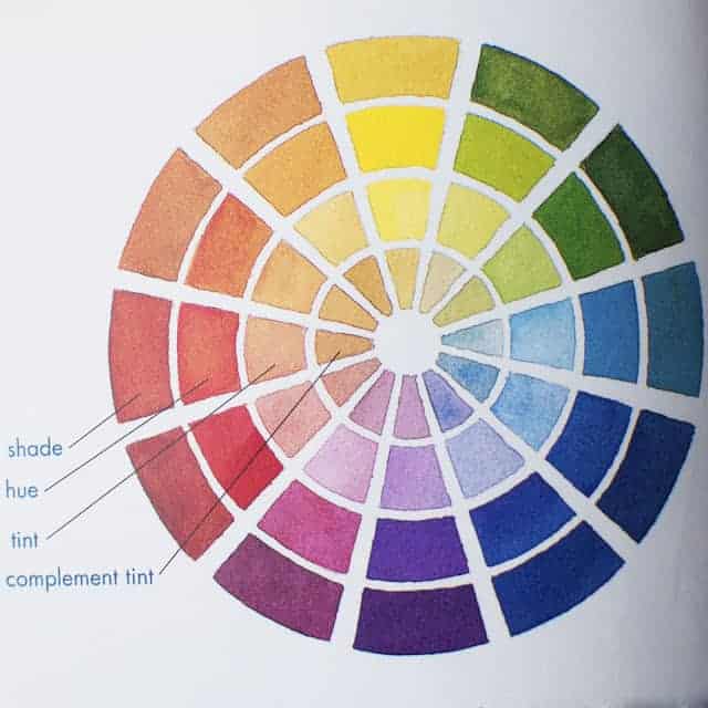
Those days are gone, when the site templates used to be crafted using a colorful background. Sometimes, content is not readable due to these flashing themes that leads to diverting users’ attention from the text. So it will be good to paint the single tone color that is the shade of dark red or blue color for web content. This method is focused on the user-friendly content for visitors to know the content very well.
- Must Read: 7 Pages Every Website Must Have

Using Responsive and Adaptive design
The current era is of mobile technology, so everybody find using the internet at smart phones, a very convenient way to reach the site. It is necessary that the site should work on the mobile technology, which can only be possible with the help of responsive or adaptive design. Responsive design adjusts the webpage according to that device dynamically while Adoptive Design has to be the pre-coded for different mobile devices.
- Must Read: Effective Rules For A Responsive Webdesign

Conclusion
Hope that, you get every point clear very well. These all technique is of current time. As the day is advancing, might be there is a chance of some new technology come and bowl you down. It will be good to change the mechanism of designing the site from time to time.If you have any great idea except all those points that are mentioned above, then please share through the comment section given below.


6 Comments
Hi,Oscar Frank
Thank you for sharing such effective web development and design tools.
You are welcome anytime Poulami
This is really a great post. Very informative. People can really learn something from this. Thank you for sharing this post.
Thanks Cassie 😉
I think e-comm sites look better with horizontal scrolling.However for blogs it may not be that appealing.
Same here. I quite agree with your view. Thanks for contributing your quater here. 🙂